When Your Color Palette Betrays Your Story’s Mood
A video can look polished and still feel emotionally wrong when its colors follow taste, realism, or brand habits instead of the story beat. Here’s a practical framework for color palette video storytelling, with a worked example, viewer-test prompts, and a checklist you can use on your next edit.
By VideoCue · Created with AI assistance and automated editorial checks.
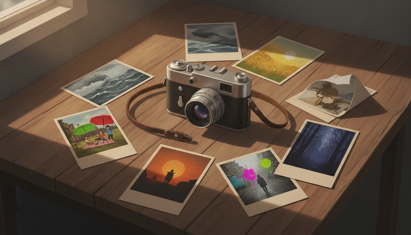
A video can be clean, sharp, and professionally finished—and still feel emotionally off.
The exposure is fine. Skin looks normal. The grade is consistent. But the scene that should feel uneasy reads as calm, or the ending that should feel hard-won lands as oddly glossy. Usually that mismatch is not a camera problem. It starts when the palette is chosen for preference, realism, or brand consistency before it is chosen for dramatic function.
That is the real problem in color palette video storytelling. A lot of creators treat color as the final polish layer: make it attractive, make it match the location, make it fit the brand. Story-led grading starts somewhere else: what should the audience feel in this beat, and what color behavior helps that feeling arrive?
Color absolutely shapes how viewers read a frame. Film scholars and practitioners have long treated color as part of narrative meaning, not just decoration, with hue, saturation, and contrast influencing emotional and thematic interpretation in context (StudioBinder’s overview of color in film). Production designers and cinematographers also routinely use palette shifts to support tone, character, and story progression rather than merely reproduce literal reality (NFI on color in film).
We’ll use one fictional example throughout. Milo is cutting a short documentary about a community garden facing demolition. His first instinct makes sense: lean into the garden’s real greens, warm soil, and pleasant afternoon light. The footage looks good. But viewers describe the early cut as more hopeful than urgent. Milo’s fix is not to abandon the place. It is to separate location color from emotional color and let the second one lead.
If you want to map beats as you read, the Narrative Arc Plotter is a handy place to sketch the emotional turns before you grade.
The palette can be accurate and still be wrong
One of the easiest mistakes to make is assuming realism is emotionally neutral. It isn’t. The colors already present in a location affect the audience’s first impression before you do anything stylized. Warm practical lights do not feel like cool office panels. Dense foliage does not feel like concrete and steel. If you preserve and amplify the dominant hues of a location, you are still making a storytelling choice.
That sometimes helps. If the place already supports the mood, realism and emotion can work together. But when the location’s natural palette fights the dramatic aim, literal color can betray the story.
Milo’s garden is a good example. Healthy greens and warm sunlight often carry associations of growth, care, vitality, or calm, depending on context (NFI on how color associations shape film mood). Those associations are not fixed laws, but they are common enough to matter. Milo’s central question is not “isn’t this place beautiful?” It is “what does it feel like when something communal and fragile is under threat?” If the grade keeps celebrating lush greens in every section, the threat never fully arrives.
This is also where brand systems need some judgment. Video brand guidelines are useful because they define recurring visual elements like color usage, typography, logo placement, and style so teams can stay consistent across projects (Tribe Pictures: How to Create Video Brand Guidelines). But that source supports process and consistency, not a scene-by-scene grading theory. A video can be perfectly on-brand and still miss the emotional target of a specific moment.
The key shift is simple: stop asking only which colors belong to the subject, and start asking which colors belong to the moment.
Separate subject color from story color
A practical way to think about this is to split what you see into two layers.
Subject color is the literal color in the frame: leaves, walls, signs, skin, clothing, sky, product packaging, dirt, lights.
Story color is the hierarchy you create so the scene feels the way the story needs it to feel.
Those layers overlap, but they are not the same thing. A café may be full of warm tungsten light, but a breakup scene inside it does not have to read as cozy. A sterile office may already skew cool, but a breakthrough scene there might need one carefully protected pocket of warmth. Filmmaking references on color repeatedly stress that meaning comes from arrangement and contrast, not hue names alone (StudioBinder on contextual use of hue, saturation, and contrast).
In practice, that means your meaningful grading decisions are often small and directional:
- which hue family dominates
- which hues get desaturated first
- where warmth is allowed to live
- whether coolness stays in shadows or spreads through neutrals
- whether contrast feels soft or severe
- whether one saturated accent should puncture an otherwise restrained frame
This is why one favorite LUT across a whole project often creates emotional flattening. It may unify footage, but it can also erase the difference between memory, pressure, threat, determination, and release. Color scripting in animation and live action alike often works as progression, not as one permanent look for every beat (Pixar’s discussion of color scripting and emotional progression).
For Milo, the answer is not “remove green.” It is “stop letting green tell the whole story.”
Build an emotional beat chart before you grade
The smartest color choices usually happen before the color page.
If you correct and prettify each shot one by one, you may solve technical problems without building a dramatic arc. Story color works better when it follows structure.
Before creative grading, make a simple beat chart with three columns:
- story beat
- intended feeling
- palette behavior
For Milo’s documentary, that chart might look like this:
- Opening memory — affection, history, care — muted amber, softer contrast
- Threat appears — unease, intrusion — cooler neutrals, restrained greens
- Pressure builds — fragility, frustration — reduced warmth, narrower saturation range
- Collective action — energy, courage — selective warm accents against a cooler field
- Closing note — resolve without false victory — measured warmth, controlled saturation
That is much more useful than labeling sections “interview,” “B-roll,” and “ending.” Those are editing categories, not emotional instructions.
A beat chart also prevents a common mistake: deciding the entire project should have one mood. Most stories need progression. Nostalgia should not look exactly like threat. Threat should not look exactly like action.
If you’re working with a team, this written chart helps align taste before anyone starts pushing sliders. Tribe’s guidelines piece is useful here for process: it recommends reviewing current brand standards, getting team input early, and using checklists during pre-production and post-production so decisions stay intentional (Tribe Pictures on review, team input, and implementation). If you want a simple planning surface, the Storyboard Builder also works well for pairing each scene card with a mood note.
Worked example: rebuilding the grade beat by beat
Now let’s make this practical.
Milo has three kinds of footage: interviews with gardeners, observational garden B-roll, and rally footage with neighbors organizing. In the first pass, he boosts greenery, keeps sunlight pleasantly warm, and adds tasteful contrast. Nothing looks amateur. But because the inviting palette covers almost every scene, the edit keeps whispering that the world is stable and healthy.
So he rebuilds.
Step 1: normalize before stylizing
First, Milo gets exposure, white balance, and contrast into the same baseline world. If one interview leans green, another magenta, and a B-roll sequence is much flatter than the rest, mood decisions will be unreliable. This stage is technical, not expressive.
Step 2: identify the emotional saboteur hue
In this project, the problem is not all warmth. It is overconfident yellow-green foliage. The greens are doing emotional work the story has not yet earned.
So Milo selectively lowers the saturation of yellow-greens and greens in the garden shots. He is not making the place dead. He is stopping the leaves from announcing optimism in every frame.
Step 3: open with memory, not tourism
For the opening, he wants nostalgia and community care, not a lifestyle promo. He warms highlights and midtones slightly, but lowers overall saturation and softens contrast. Warmth plus restraint reads more like memory than celebration.
Step 4: bring in threat through neutrals
When fencing, notices, and machinery enter, Milo does not slap a dramatic blue wash across everything. Instead, he lets cool blue-grey tones creep into pavement, paper, metal, cloud cover, and shaded neutrals. The coolness behaves like the threat itself: an intrusion into an existing world.
Step 5: protect skin so people stay human
If mood pushes go too far, faces suffer first. Skin goes waxy, grey, or sickly. That usually weakens the scene.
Milo keeps skin near its corrected baseline while cooling the environment around it. In a story about community action, faces are the anchor.
Step 6: reserve warmth for earned action
At the rally, he does not swing the whole film back into golden comfort. Instead, he allows selective warm accents: painted signs catching sun, hands in late light, a scarf, a face turning toward the crowd. Because the broader palette stays restrained, those warm notes feel like agency rather than reassurance.
Step 7: keep the ending honest
The ending aims for resolve, not fantasy. Milo lets some warmth return, but not enough to erase uncertainty. The story can close with commitment without pretending the fight is over.
Here’s a more concrete shot-level example you can borrow immediately.
SCENE: Interview by raised garden beds under warm late-afternoon sun.
STORY BEAT: The speaker explains that the city has posted demolition notices.
PROBLEM IN FIRST PASS: The greens feel lush and hopeful, so the threat lands softly.

BEFORE
- Global warm balance maintained from camera image
- Green and yellow-green saturation left strong
- Sunlit soil and leaves dominate the frame emotionally
- Viewer read: “This place is lovely” more than “this place is vulnerable”

AFTER
- Reduce yellow-green saturation roughly 15–25% in foliage range
- Cool shadow neutrals slightly toward blue-grey
- Keep skin close to baseline, avoiding a cold cast on the face
- Pull overall saturation down a little, rather than crushing all color
- Let one warm highlight remain on cheek or hands for human presence

COMPARE THE READ
- Before: inviting, calm, healthy
- After: still natural, but more fragile, pressured, and story-relevant

SAMPLE SCRIPT MOMENT
Speaker: “We planted here for eight years. Then the notice went up.”
Visual goal: The frame should still honor the garden, but the color should stop promising safety.
Important limit: those numbers are not universal settings. A 15–25% reduction may be too much or too little depending on the camera, lighting, codec, how the image was normalized, and whether you are working from log or Rec.709. Treat the direction as the lesson, not the exact value.
If you want to lock these decisions for repeat projects, a lightweight Video Style Guide can help separate your recurring brand rules from beat-specific mood variants.
How to test the grade with viewers
Once the grade feels right to you, show it to a few viewers without over-explaining what you changed.
A short viewer check is useful because color choices can feel “obvious” to the editor and invisible to everyone else. You’re not asking them to diagnose the node tree. You’re checking whether the emotional turn is legible.
Use prompts like these:
- At what moment does the threat first become visible or emotionally real?
- Does the rally feel earned, or does it feel reassuring too early?
- Which frames, if any, feel too pretty for the stakes of the story?
- Did any section feel emotionally inconsistent even though it looked polished?
You can also do a silent-viewing pass. Watch once with the sound off and note whether the emotional turns still read. Then watch with sound back in. If the color arc becomes clearer in silence, the palette is doing useful story work instead of leaning entirely on music or narration.
What to do when brand colors fight the scene
This comes up constantly in marketing videos, creator businesses, and recurring channel formats. The brand kit says bright and upbeat. The story beat says pressure, uncertainty, or grief.
Usually the answer is not to abandon branding. It is to separate brand recognition from scene emotion.
Tribe’s video-brand-guidelines article is useful for exactly this part: recurring color usage, graphics standards, accessibility, and review process (Tribe Pictures on visual elements and accessibility). It does not require every footage scene to be graded as if it were a cheerful end card.
A practical compromise usually looks like this:
- keep brand colors strongest in graphics, titles, lower thirds, and end cards
- use brand hues as accents inside footage, not always as the dominant world color
- create approved mood variants such as neutral, urgent, reflective, and celebratory
- reserve the brightest brand expression for moments the story actually supports
That way consistency lives in the system, not in flattening every emotional beat into one look.
Pitfalls, tradeoffs, and a quick checklist
Once you start grading for mood, there are a few traps to watch.
Common pitfalls
- Making every frame pretty instead of useful. Attractive images can still erase emotional contrast.
- Using simplistic color formulas. Blue is not automatically sad and yellow is not automatically hopeful; context does the heavy lifting (StudioBinder on context over fixed color equations).
- Breaking skin for the concept. In most creator video, believable faces matter more than aggressive palette theory.
- Ignoring mixed light. Daylight, LEDs, screens, and practical lamps often need local control, not one global look.
- Hurting readability. If your captions or lower thirds disappear on mobile, the mood gain may not be worth it. Tribe specifically calls out text visibility, captions, and testing across devices as part of accessible video guidelines (Tribe Pictures on accessibility and text visibility).
Quick checklist
Before grading
- list the beats in order
- write the intended feeling beside each
- note the natural color bias of the footage
- mark where that bias helps and where it hurts
- choose one main palette move per beat
During grading
- normalize exposure and white balance first
- reduce the most misleading hue before adding style
- protect skin and key subjects
- tie color changes to story turns, not random shot changes
- use selective accents instead of saturating everything
Before export
- watch once with sound off
- ask where the emotional turn first becomes visible
- check text and captions on a phone
- compare opening and ending frames side by side
- pull back any adjustment that feels decorative rather than dramatic
Next steps: apply it in this order
When your palette betrays your story, you usually do not need a more cinematic preset. You need a clearer story decision.
Use this three-step order on your next edit:
- Create a beat chart so each section has an intended feeling, not just a label.
- Identify the emotional saboteur hue—the color family that keeps telling the wrong story.
- Run a silent-viewing check before export to see whether the emotional turn is visible even without help from sound.
That is the practical core of color palette video storytelling. Location color is raw material. Brand color is a constraint. Story color is the thing that decides whether the audience feels the right shift at the right time.