The Platform Translation: Rebuilding Your Hook for Audio-First vs. Visual-First Scrolling
Repurposing one intro across YouTube, TikTok, and audio usually weakens the idea instead of saving time. The fix is to rebuild the opening around what the audience can actually perceive first: image, personality, or sound.
By VideoCue · Created with AI assistance and automated editorial checks.
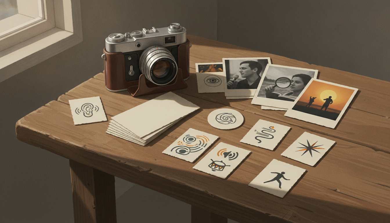
A hook changes when the audience changes
A lot of repurposing goes wrong in the opening.
A creator makes one solid segment, then pastes the same intro onto YouTube, TikTok, and an audio version. On paper, that feels efficient. In practice, it often breaks the promise before the content even starts.
The issue is not that one platform is “faster” and another is “slower.” It’s that audiences encounter the same idea through different sensory and social setups.
On visual feeds, people often register picture-level cues before they fully process a sentence: motion, a face, contrast, text, or an unusual object in frame. In film and television studies, this basic split between image and sound processing is built into how editors work with attention, orientation, and continuity. A cut can direct the eye before narration explains it; sound can prepare or reshape how an image is understood. If you want a practical edit-side primer on this relationship, our guide to the J-cut and the L-cut is useful because it shows how viewers often receive sound and picture on slightly different timings.
On audio-first platforms, that visual shortcut disappears. If the opening relies on “look at this,” a listener gets no hook at all. They need a sound, a voice, or a line vivid enough to create a mental picture and orient them quickly.
That is why platform-specific video hooks matter. You are not changing the topic. You are changing the audience’s first usable cue.
Two of the supplied sources are still useful here, but only in a limited way. HypeNest’s TikTok hooks and retention article works best as a practitioner framework: think in terms of a visual trigger, a verbal promise, and context. It is not proof of universal platform behavior, but it is a helpful editing lens. And PPC Land’s reporting on Substack mobile video publishing is a reminder that discovery context is not one thing anymore: some video now reaches people through app notifications and email delivery, not just feed scrolling. That changes what kind of opening makes sense.
The useful mindset is simple:
- keep the core idea
- change the first cue
- change the order of information
- change the type of curiosity
That is platform translation.
Visual-first and audio-first openings do different jobs
Before you rewrite anything, it helps to define the opening job more precisely.
In visual-first environments, the frame often carries the first promise
Short-form video and feed-based discovery usually begin with a glanceable decision: is this readable, relevant, or intriguing enough to stay with for another beat?
That does not mean you need a loud edit, a gimmick, or a fake cliffhanger. It means the opening should be legible as a visual event.
Useful first cues on visual platforms include:
- a face with clear emotion or intent
- an object already doing the interesting thing
- a strong before/after contrast
- text that clarifies the premise at a glance
- visible motion that points to a cause or result
This is where many reposts fail. The original YouTube cut might open with scene-setting narration that works fine once a committed viewer has clicked. But in a feed, that same setup can feel abstract because the image is not yet doing enough work.
If you are cutting for vertical formats, our guide on the 30/60/90-second cuts of the same video is a useful companion, because the runtime shift is usually also a promise-order shift.
In audio-first environments, the opening has to build the picture indirectly
Audio has its own strengths, but it needs a different kind of precision.
A listener can be pulled in by:
- an identifiable sound event
- a voice with immediate stakes or surprise
- a descriptive line that paints the missing image
- a short contrast between what something sounds like and what it actually is
What audio usually cannot borrow is silent visual ambiguity. If the listener hears an unexplained scrape, pop, or splash, that can create intrigue for a moment. But the payoff has to be orientation, not delay for its own sake.
In other words: in visual content, you can sometimes let the image ask the question first. In audio, you usually need to ask and ground the question almost together.
The social feel of the platform matters too
Not every opening is just sensory. Some are relational.
A host-led TikTok often works because the creator is the organizing cue. The viewer is not only watching an event; they are being addressed by a person.
A YouTube explainer can sometimes lean more on constructed curiosity because the viewer has accepted a stronger topic contract.
A podcast or audio post often borrows trust from voice, pacing, and clarity more than visual spectacle.
That is why the same source material can support three different hooks without becoming three different ideas.
A practical decision tree for platform-specific video hooks
When you repurpose, do not start by trimming seconds. Start by identifying what the idea gives you to work with.
Step 1: Write the core promise in one sentence
Before you touch the opening, write the segment’s promise as plainly as possible.
Examples:
- I’m going to show why ferrofluid forms spikes around a magnet.
- I’m going to explain why this camera setting changes the whole shot.
- I’m going to show the mistake that makes this budget break.
If the promise is muddy, every version will feel muddy.
Step 2: Pull out three opening assets
Use a simple worksheet. Do not just list your best line. Pull one asset from each channel.
Worksheet
- Best image: what single shot makes the idea instantly visible?
- Best line: what one sentence states the intrigue or tension clearly?
- Best sound: what audio event, texture, or phrase creates curiosity on its own?
Filled-in example for the fictional Rust Belt Physics ferrofluid segment:
- Best image: macro shot of black ferrofluid rising into sharp spikes around the magnet
- Best line: “This liquid is showing you the shape of a magnetic field.”
- Best sound: magnet set on the table, container shift, slight wet metallic movement from the setup
That worksheet is deliberately small. Most creators over-outline here. You just need one strong candidate from image, language, and sound.
If you are working from an existing YouTube cut, a transcript can help you isolate the best line without rewatching the whole thing. The YouTube Transcript Downloader is handy for that kind of rewrite pass.
Step 3: Match the asset to the platform’s first mode
Now ask a brutally simple question: what does the audience get first on this platform?
- If they mainly get a frame first, lead with the image.
- If they mainly get a person first, lead with the host.
- If they mainly get sound first, lead with the audio event and immediate orientation.
This is where HypeNest’s framework is useful as an editorial checklist rather than evidence: opening cue, verbal promise, context. Build those in the right order for the platform instead of forcing the same sequence everywhere.
Step 4: Choose one curiosity type
Pick one, not five.
- Visual curiosity: What is that thing doing?
- Mechanism curiosity: How does that work?
- Personal question: Would I answer this if someone asked me directly?
- Outcome curiosity: What happens next?
- Sonic intrigue: What am I hearing?
When repurposed openings feel weak, the usual problem is that the creator has not chosen a dominant curiosity type.
Step 5: Reorder the information
This is the real rewrite.
Do not just shorten the original intro. Change the sequence.
Typical moves:
- show the result before naming it
- put the host on camera before the demo
- play the sound before describing the setup
- move the clarifying line earlier in audio
- remove context that only mattered in the original format
If you want to plan three opening variants side by side before editing, the Storyboard Builder is a clean way to lay out shot, line, and duration without changing the middle section yet.
Worked example: one topic, three openings
Let’s use the fictional science explainer from the brief: Rust Belt Physics.
The source material is a 90-second segment about ferrofluid behavior around a magnet. The key constraint matters: the middle section stays basically the same. Only the opening is rebuilt.
Version 1: YouTube opening built around visual curiosity
For YouTube, the best opening asset is probably the macro image itself. Ferrofluid already looks strange enough to earn attention visually.
So the opening job is not “explain immediately.” It is “let the viewer see the phenomenon, then name the mechanism.”
Why this fit makes sense:
- the image can ask the first question
- the delayed explanation feels intentional, not confusing
- science explainers often benefit from a short visual puzzle before the answer
Version 2: TikTok opening built around direct address
For TikTok, the same image is still useful, but the host can do more of the opening work.
A face-to-camera question gives immediate context and social energy. Instead of only asking “what is that?”, the viewer also gets “why is this person showing me this right now?”
Why this fit makes sense:
- the host becomes the organizing cue
- the premise is clear faster
- the demo can arrive right after the question
Version 3: Audio opening built around sonic intrigue and orientation
In audio, the visual puzzle is gone. So the opening has to create a different sensory entry point.
A small real-world sound from the setup can work, but only if the narration quickly anchors it. Otherwise it is just texture.
Why this fit makes sense:
- sound replaces the missing visual event
- the listener gets a reason to imagine the setup
- the orientation line rebuilds the picture verbally
Here is a worked before/after set you can copy as a method.
FAILED CROSS-PLATFORM REPURPOSE
Used everywhere:
[Wide shot of table. Host off camera.]
Host: "Okay, so today we're talking about ferrofluids, which are really interesting materials in physics, and I wanted to show you something..."
[Three seconds later, magnet enters frame]

Why it fails:
- On YouTube, the image starts too generically for a visual phenomenon.
- On TikTok, the setup line arrives before the interesting event.
- In audio, "show you something" gives the listener nothing usable.

CORRECTED YOUTUBE VERSION
[Macro close-up: ferrofluid spikes rise into frame]
VO: "This isn't CGI. It's a liquid tracing a magnetic field into visible spikes."

CORRECTED TIKTOK VERSION
[Host on camera, magnet already visible]
Host: "Have you ever seen a liquid react like it knows the magnet is coming?"
[Cut immediately to the ferrofluid response]
Host: "Watch the surface when I move this closer."

CORRECTED AUDIO VERSION
[SFX: magnet placed near container; subtle shift from the setup]
Host: "That sound is a liquid reorganizing around a magnet. If you could see it, it would look like black metal growing spikes."
Notice what stays fixed across all three versions:
- same topic
- same core scientific point
- same middle explanation
Notice what changes:
- first sensory cue
- narrator position
- order of reveal and explanation
- type of curiosity
That is the whole game.
What not to do when repurposing the opening
A few pitfalls show up constantly.
Mistaking speed for clarity
A fast cut is not automatically a good hook. If the viewer or listener cannot tell what the segment is about, the opening may be energetic but still weak.
Copying a visual line into audio
“Look at this” is not an audio hook. Neither is “watch what happens.” In audio, replace visual dependence with either a sound event or language that reconstructs the scene.
Over-explaining before the interesting part
Creators often bury the phenomenon under background. You usually need enough context to orient, not a lecture before the opening lands.
Breaking the promise in the middle
A strong hook that leads into a slow, mismatched middle feels manipulative. HypeNest is useful on this point as a practitioner reminder: the opening promise and the middle pacing need to match. Treat that as an editing standard, not a platform law.
Assuming every platform wants the same kind of host presence
Some ideas work best when the creator is the hook. Others work best when the object or event is the hook. Do not force face-cam onto footage that is already visually self-explanatory, and do not hide the host if the social connection is the main asset.
A short checklist before you publish
Run this before you export platform variants:
- Is the core promise the same across versions?
- Did you identify one best image, one best line, and one best sound?
- Does the first cue match what the audience can perceive first on that platform?
- Did you reorder the opening instead of only trimming it?
- Is the curiosity type clear?
- For audio, did you orient the listener right after the intriguing sound or line?
- For visual platforms, is the first frame meaningful without waiting for a full explanation?
- Does the middle section actually deliver what the opening promises?
Your next step: run a controlled opening test
The cleanest way to learn this is with one topic and one unchanged middle.
Here is a practical mini-test plan:
- Pick one existing segment that could plausibly work on more than one platform.
- Write the core promise in one sentence.
- Build two or three opening versions only:
- one image-led
- one host-led
- if relevant, one sound-led for audio
- Keep the middle section as close to identical as you can. Same explanation, same examples, same ending.
- Show the versions to a small review group or trusted peers before publishing.
- Ask them only a few focused questions:
- What do you think this segment is about from the opening alone?
- What made sense immediately?
- Where, if anywhere, were you confused?
- Did the middle feel like it delivered the opening promise?
- Take notes on comprehension, confusion, and whether the opening cue felt natural for the platform.
- Revise the opening that caused the most confusion, not the one you simply “liked” least.
That kind of test will teach you more than generic hook advice, because it isolates the opening as an editorial decision instead of turning the whole result into a guess about trends or algorithms.
The big takeaway is straightforward: don’t repurpose the same intro everywhere. Repurpose the audience’s first experience of the idea.
When you do that, you keep the segment’s core value intact while giving each platform the kind of opening it can actually use.