The Description Graveyard: Writing YouTube Descriptions That Earn Their Real Estate
Most YouTube descriptions get treated like a storage closet for links, timestamps, and leftover copy. Better YouTube description writing uses the opening lines as packaging: a clear continuation of the title and thumbnail that sets expectations before anyone clicks “more.”
By VideoCue · Created with AI assistance and automated editorial checks.
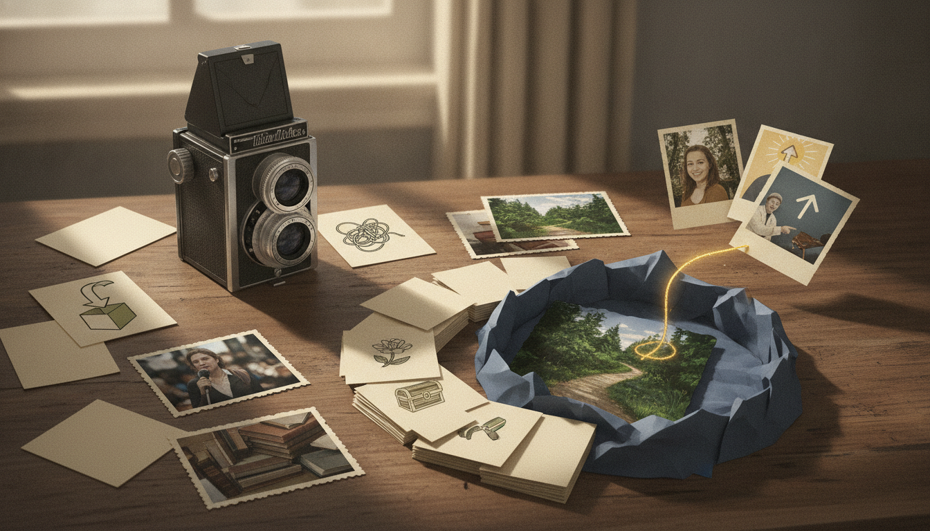
Most YouTube descriptions fail for a simple reason
A lot of creators do not really write descriptions. They fill them.
A quick summary. A chapter dump. A stack of links. A subscribe line. Maybe hashtags. Technically complete, but not doing much work.
That is the real problem with YouTube description writing: the box gets treated like storage instead of part of the package.
There is still a metadata job here, and YouTube is fairly clear on the baseline. On YouTube for Creators: Helpful Resources, YouTube says channel growth comes from creating videos viewers want to watch and accurately presenting them with the title, thumbnail, and description. That is the safe foundation: clarity, accuracy, and alignment.
So this is not a theory about secret algorithm windows, description engagement signals, or hidden testing phases. A description is better understood as packaging and expectation-setting.
A strong description will not rescue a weak video. It also should not be credited for performance changes that could easily come from topic choice, thumbnail strength, title clarity, or the opening seconds of the video itself. But a weak description can absolutely create mismatch. It can make a good video feel vague, generic, or more transactional than useful.
That is why a better way to think about the description is this:
It is the next sentence after the title and thumbnail.
The opening lines should usually do three jobs:
- Clearly say what the video covers.
- Add the angle, tension, or payoff this version delivers.
- Set expectations so the viewer is less likely to misread the format or promise.
Everything after that—chapters, links, resources, CTAs, disclosures—matters, but only after the page makes sense.
What the “second hook” actually means
A good description opening usually should not just repeat the title.
It should continue it.
If the title says what the video is about, the description can say what is specific, easy to misunderstand, unusually useful, or worth paying attention to in this treatment of the topic.
That is the “second hook.” Not hype. Not withholding. Just continuation.
Weak openings:
- “In this video I explain Hawking radiation.”
- “Here are my camera settings.”
- “This tutorial shows how to edit faster.”
Accurate, yes. Memorable or useful, not really.
Stronger openings:
- “The version most people remember about Hawking radiation is useful, but incomplete.”
- “These camera settings look wrong in preview, but they solve the highlight problem most beginners fix too late.”
- “This editing speed gain is not a shortcut key. It is the step that removes unnecessary decisions from your timeline.”
Those lines still name the topic, but they also answer the viewer’s silent question: why this one?
This fits YouTube’s own framing. In Helpful Resources for YouTube creators, YouTube says to think carefully about your title, description, and thumbnail because they should accurately reflect your content and let viewers know what to expect. So the goal is not to tease beyond the truth. It is to summarize the real angle clearly enough that the packaging and the video feel like the same promise.
A practical test: if your description opener could be pasted under ten other videos in your niche without sounding wrong, it is probably too generic.
Write for truncation, not a magic character count
A lot of YouTube advice repeats exact visibility numbers for descriptions. Third-party guides often say only the first 100 to 160 characters or roughly the first 150 characters may show before a viewer expands the rest, including vidIQ’s guide to YouTube video descriptions, Clipchamp’s YouTube description guide, and Income School’s guide to YouTube descriptions.
That is useful as a working range, but not as a fixed law. Different surfaces and devices can show different amounts. So if you mention truncation, the honest version is this: treat the first one or two short lines as the part most likely to matter first. That is a practical heuristic based on interface variability, not a universal benchmark.
So the safer move is not to worship a fixed number. It is to write for truncation.
- put the core topic early
- put the useful angle early
- avoid opening with links or admin copy
- keep the opening readable without needing the rest
- use line breaks so the top section is visually distinct
Here is a concrete example.
BEFORE TRUNCATION VIEW
Subscribe for more videos every week → https://example.com
My presets, gear links, socials, and newsletter below.

What a viewer learns before “more”:
- basically nothing about the video

AFTER TRUNCATION VIEW
How to fix muddy voiceover audio without buying a new mic.
This walkthrough is for untreated rooms, and the biggest fix happens before EQ.

What a viewer learns before “more”:
- the topic
- who it helps
- what kind of payoff to expect
A simple formatting pattern that travels well:
- Line 1: topic + angle
- Line 2: expectation-setting or audience fit
- Line 3 onward: short summary, chapters, links, CTA, admin copy
If you want the top section to stay clean while you build the rest of the package, a bundling tool like YouTube Metadata Packer can help you validate fields after the messaging is already clear, instead of leading with admin tasks.
When direct clarity beats a second hook
Not every video wants intrigue.
Some videos need less framing and more immediacy.
Urgent how-tos
If someone clicked because chapters are not showing, their export failed, or their mic is clipping, do not add mystery. Lead with the fix.
For example: “Fix YouTube chapters that are not appearing by starting at 0:00, using at least three timestamps, and making each chapter at least 10 seconds long.”
If you want to state those chapter requirements as platform rules, use YouTube’s own source. In YouTube Help on video chapters, YouTube says automatic or manual chapters require a first timestamp of 0:00, at least three timestamps listed in ascending order, and a minimum chapter length of 10 seconds.
Highly searchable utility queries
For direct search intent, clarity usually beats cleverness.
Better: “How to remove background noise in Premiere Pro using DeNoise, EQ, and a simple room-tone patch.”
If someone is searching for a fix, they usually want to confirm relevance fast. Clever phrasing can blur that.
Videos where the conclusion should be immediate
Some explainers, news updates, and comparisons lose trust if the description sounds like it is withholding the answer.
In those cases, state the conclusion up front, then add nuance below.
A useful rule: if delaying the answer would frustrate the viewer more than it would help frame the experience, skip the second hook and choose direct clarity.
A practical framework for YouTube description writing
Here is a structure that works well for many long-form uploads.
1) Open with topic plus angle
Your first line should answer two questions quickly:
- what is this video about?
- why is this version worth watching?
Useful patterns:
- Topic + contradiction: “Black holes do not ‘glow’ in the simple way the popular explanation suggests.”
- Topic + outcome: “This audio fix matters more than the EQ chain most creators obsess over.”
- Topic + tension: “This description strategy is less about stuffing keywords and more about setting the right expectation.”
2) Add one expectation-setting line
This is where you prevent the wrong takeaway.
You might:
- say what the video is not
- name the oversimplified answer
- explain who the video is for
- signal that the explanation builds in stages
That last move is especially useful for tutorials and explainers. It tells viewers how to read the video before they misjudge it.
3) Make the rest scannable
After the opening, organize the rest for use.
A solid middle section can include:
- a brief plain-language summary
- chapters, if they genuinely help navigation
- one useful related resource
- one next-step video or playlist
- one clear CTA
For the chapter block itself, format it carefully. You can do that by hand, or use something like YouTube Chapter Generator, which turns timestamps into a clean chapters block and validates the chapter rules YouTube checks.
If you want to improve what each chapter is doing, not just how it is formatted, The 5 chapter cards every explainer video needs is a helpful companion.
4) Use relevant language naturally
Descriptions can help clarify topic relevance, but that does not justify robotic keyword stuffing.
Third-party guides such as vidIQ’s YouTube video descriptions guide and Clipchamp’s guide to YouTube descriptions both make the practical point: include relevant terms, especially near the top, but write for humans first.
A simple rule:
- mention the main topic naturally in the opening
- repeat it only where it still sounds normal
- use related terms only if they genuinely belong
If the sentence sounds like it was written for search before people, rewrite it.
5) Put links below clarity
The description is rarely improved by leading with a stack of outbound links.
A better order is:
- what the video is
- how to read or use it
- chapters or supporting detail
- one contextual link
- one CTA
- everything else lower down
That does not mean links are bad. It means links should arrive after the viewer knows why the video matters.
Worked example: before, after, and reusable templates
Let’s turn the physics example into something transferable.
Assume Tomas runs a science channel. The video title is Why Black Holes Glow. The title and thumbnail already create curiosity. The description’s job is to clarify the promise and set expectations for the explanation style.
BEFORE
In this video we discuss Hawking radiation. Subscribe for more science. Links below.

Why it falls flat:
- It labels the topic, but adds no angle
- The CTA appears before the value
- It gives no expectation for how the explanation unfolds
- It feels disconnected from a strong title/thumbnail package

AFTER
Black holes do not “glow” in the simple way most people mean, and the familiar virtual-particle explanation is only part of the story.

This explainer is for viewers who want the cleaner version without the jargon wall. The key idea arrives in stages, so the early simplification sets up a correction later.

In this video:
- why “glow” is already a misleading shortcut
- where the virtual-particle story helps
- where that story becomes too simple
- the later framing that changes how the whole topic reads

Chapters
0:00 The explanation most people remember
0:42 Why “glow” is a misleading shortcut
2:15 The virtual-particle picture
4:03 Where that picture breaks down
6:12 A cleaner way to think about Hawking radiation

If you want a next step after the video, start with the original paper or the follow-up explainer linked below.
Why the rewrite works better:
- Line 1 names the topic and adds a real angle.
- Line 2 tells the viewer what kind of explainer this is and how to watch it.
- The bullet section previews the path without sounding like filler.
- The chapters help navigation while preserving sequence.
- The resource note is contextual instead of dumped at the top.
Now make the method reusable.
Fill-in-the-blank formula: tutorial
Line 1: Learn how to [do specific task] using [method/tool] without [common pain point].
Line 2: This is for [audience/skill level]. I’ll show [steps/outcome], and I’ll point out where people usually get stuck.
Example shape:
- Learn how to color-correct interview footage in Premiere without flattening skin tones.
- This walkthrough is for beginners moving from auto settings to manual correction.
Fill-in-the-blank formula: explainer
Line 1: [Topic] is usually explained as [common version], but that leaves out [missing idea].
Line 2: This explainer is for [audience] and builds from [starting point] to [payoff/conclusion].
Example shape:
- Inflation is often explained as “prices going up,” but that skips the part that actually changes household decisions.
- This explainer starts with the simple version, then adds the mechanism most summaries leave out.
Fill-in-the-blank formula: review
Line 1: My review of [product] after [time/context of use]: where it helps, where it disappoints, and who it actually suits.
Line 2: If you are choosing between [product] and [alternative/use case], pay attention to [deciding factor].
Example shape:
- My review of this travel tripod after three weekend shoots: where it saves time, where it feels flimsy, and who should skip it.
- If you are deciding between this and a full-size tripod, the setup speed matters more than the max height.
These formulas are not meant to make every description sound the same. They are there to force the right questions: what is this about, what is the angle, and how should the viewer read the video?
How to compare description styles without pretending it is lab science
You can compare description approaches on your own channel, but keep the claim modest.
Unless YouTube gives you a formal experiment feature for the exact element you are changing, this is observational. You are looking for patterns, not proving causation.
What to hold steady
Try to keep these as consistent as possible:
- topic category
- runtime range
- title style
- thumbnail style
- upload cadence
- intro structure
- chapter usage
- CTA style inside the video
If title, thumbnail, and description all change at once, the read gets muddy fast.
What to vary
Change only the opening section of the description for a run of reasonably comparable uploads.
For example:
- Version A: plain summary-first opening
- Version B: topic + angle + expectation-setting opening
How to judge whether the pattern is useful
Avoid hard benchmarks unless you have a trustworthy source for them. Instead, look for repeated signs of better alignment:
- comments showing viewers understood what the video was going to be
- fewer reactions that suggest “this wasn’t what I expected”
- cleaner fit between the page and the opening minute of the video
- easier self-audits of the full package
- clearer relevance in search-related analytics, if you already review those
That is not proof of cause and effect. It is still useful editorial feedback.
Simple logging table
| Video | Topic | Runtime | Title style | Thumbnail concept | Description version | Chapters used | Main link placement | Early comments on clarity/mismatch | Notes |
|---|---|---|---|---|---|---|---|---|---|
| Video 1 | A or B | Yes/No | Top/Middle/Bottom | ||||||
| Video 2 | A or B | Yes/No | Top/Middle/Bottom | ||||||
| Video 3 | A or B | Yes/No | Top/Middle/Bottom |
Pitfalls creators recognize fast
A good description is still a balancing act.
When the second hook becomes clickbait
If the opening implies a twist, secret, or contradiction that the video barely delivers, the description stops being packaging and starts being oversell.
A good test: if the opener sounds smarter than the video actually is, tone it down.
When chapters spoil the payoff
Chapters help navigation, but they can also ruin sequencing.
If your whole tutorial hinges on a reveal at the end, a chapter titled “The real fix” at 4:12 may flatten the experience. If your review builds toward a verdict, “Why I returned it” as a visible chapter can give away the turn too early.
Sometimes the better move is more neutral chapter language.
When sponsor or affiliate disclosures have to stay high
Usually, admin copy should not lead. But legal and platform compliance can override elegance.
If a sponsor disclosure or affiliate disclosure needs to be prominent, keep it clear and brief, then return immediately to the video summary. Do not let the entire visible section turn into disclosure text if you can avoid it.
When search-intent videos get harmed by clever framing
For utility videos, cleverness can reduce clarity.
A title like “The export mistake killing your audio” may work if the audience is browsing. But if the query is “how to export WAV from Premiere Pro,” match that intent directly in the description instead of trying to sound dramatic.
When link stacks turn the page into a bio sheet
If the first visible lines are website, merch, newsletter, sponsor, social links, and gear links, the description reads like a receipt. Put the useful context first.
When every line tries to do a different job
One line wants search keywords. One line wants intrigue. One line wants a sales push. One line wants a disclaimer. The result feels stitched together.
Pick the top priority for the opening: make the video legible.
Quick checklist before you publish
- Does the first line clearly name the topic?
- Does it add a real angle, outcome, or useful tension?
- Do the first one or two lines still work if the rest is hidden?
- Does the opening accurately reflect what the video actually delivers?
- Did you use relevant language naturally instead of stuffing?
- Are links placed below the core context?
- If you included chapters, do they genuinely help navigation?
- If you listed chapters, do they follow YouTube’s requirements on video chapters?
- Is there one clear CTA instead of five competing ones?
- Did you keep sponsor, affiliate, giveaway, hashtag, and social admin copy out of the first lines unless compliance requires otherwise?
Conclusion: make the description earn its space
Descriptions are not the biggest lever on YouTube. Topic choice, packaging strength, and the actual opening of the video usually matter more.
But the description is still owned space, and weak descriptions waste it.
The better question is not “did I fill the box?”
It is: did I use the box to set the right expectation?
For your next upload:
- Write the title first.
- Draft one opening line that names the topic and adds the angle.
- Add one expectation-setting line.
- Move admin copy lower down.
- Add chapters only if they improve navigation and do not spoil the experience.
- Compare that style against your old approach over time.
- Do one final metadata pass: check title and description length, chapter formatting, and whether your links support the video instead of crowding it.
That is the practical version of YouTube description writing.
Not a graveyard for leftover metadata.
A small but important piece of packaging that helps the page make sense before the viewer ever clicks “more.”