Dina Belenko
levitating ingredient still life series (Instagram, 2012-present), dark moody with conceptual staging
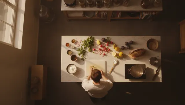
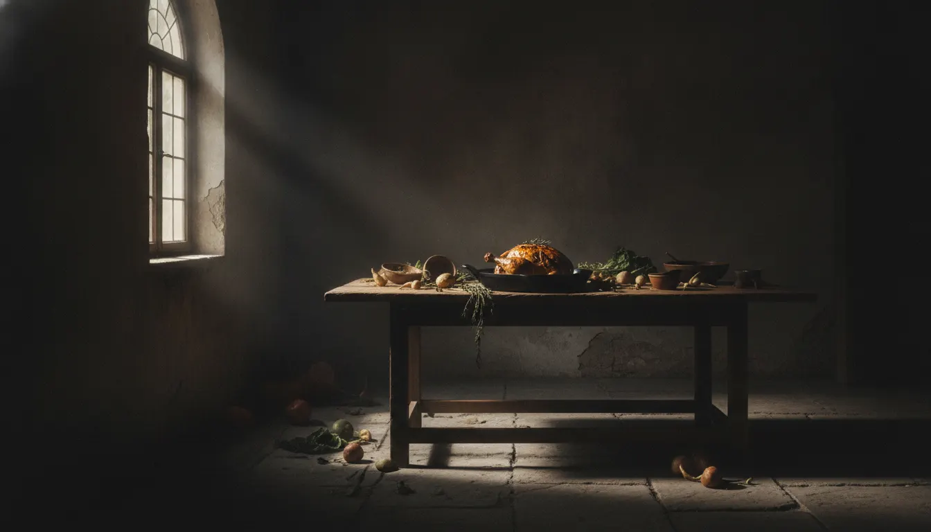
Dark-moody food photography. Single window key on cast-iron skillet, painterly Dutch-master food still life, deep shadow drama.
The moves a human crew would use to get here. Cue applies them for you, and knowing their names is how you ask for a change.
135 degrees, 40-70% shadow coverage
black background achieved with dark fabric, painted boards, or deep negative space
dark wood, slate, linen, cast iron, earthenware ceramics
key color palette: deep burgundy, charcoal, forest green, warm ochre
processing with crushed blacks, warm highlights, and slight desaturation in midtones
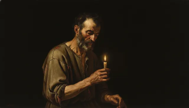
Dark moody food photography represents a deliberate rejection of the flat, bright, perfectly-lit aesthetic that dominated commercial food work from the 1980s through the early 2000s. Drawing on the Flemish Baroque tradition of still-life painting (van Honthorst, Rembrandt, and especially Dutch vanitas compositions), dark moody food work places ingredients, plates, and textures against near-black backgrounds, using a single controlled light source to carve form through shadow.
The style gained mainstream traction through the food blogging and Instagram era of the 2010s, accelerated by photographers like Dina Belenko (Russia, active from c.2012) whose levitating ingredient still lifes blended dark moody lighting with playful conceptual staging, and Helene Dujardin, whose Plate to Pixel (2011) was the first major guide to stylized food photography. The look appears prominently in Saveur magazine, high-end restaurant brand identities, and cookbook editorial photography from roughly 2014 onward.
The defining technique is a single, directional, and often modified light source - a large softbox positioned at 45-135 degrees from the subject - creating a clear shadow side that makes up 40-70% of the frame. A reflector (or none at all) on the opposite side controls how rapidly the shadow side falls to black. The result is reminiscent of Caravaggio's chiaroscuro: subjects appear to emerge from darkness, giving even simple ingredients a sense of weight and drama.
Prop choice skews toward aged wood, slate, dark marble, rough linen, iron cookware, and earthenware - textures that absorb light and add visual complexity. Color palettes favor deep burgundy, forest green, warm ochre, and charcoal against near-black grounds. Hero ingredients are often glistening - a drip of honey, cracked chocolate, a dusting of flour - to provide specular highlights that act as compositional anchors.
levitating ingredient still life series (Instagram, 2012-present), dark moody with conceptual staging
2011
*Plate to Pixel: Digital Food Photography and Styling*
dark editorial food photography, 2014-2020 issues
Australian food editorial using dark moody styling in the 2010s
Copenhagen restaurant photography, chiaroscuro approach
cookbook editorial for European publishers, dark still-life tradition
A Look is not a filter. It is a set of stored decisions the pipeline reads before it makes a single frame, so two videos in the same Look actually match.