Spider-Man: Into the Spider-Verse
Sony Pictures Animation, 2018 (technique originator)
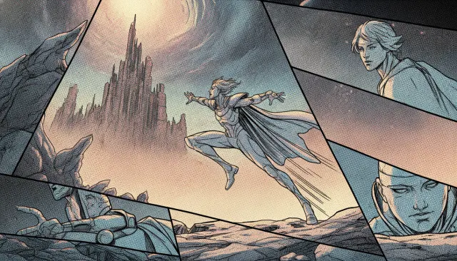
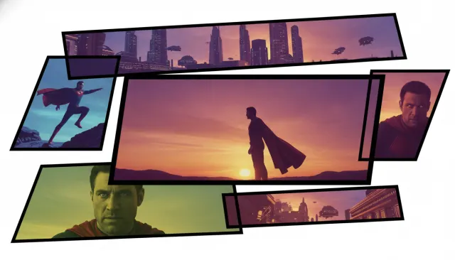
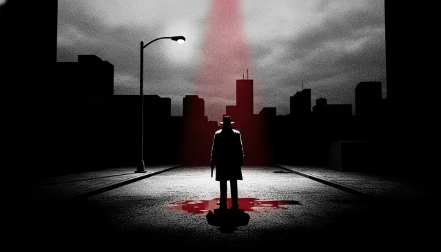
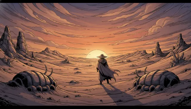
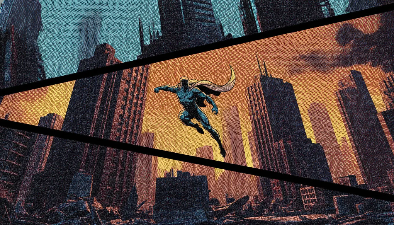
Spider-Verse comic-print 3D treatment. CMYK halftone pattern, registration-misaligned color, comic-page panel inserts.
The moves a human crew would use to get here. Cue applies them for you, and knowing their names is how you ask for a change.
Day halftone dot patterns keyed to luminance: dense in shadows, sparse in highlights
to-frame ink outline weight variation creating 'held illustration' temporal texture
character print layer weighting: Gwen's watercolor, Noir's desaturated press black, Miles's classic four-color
specific panel sequences
twos character animation against 24fps environmental rendering
Where the broader Sony Spider-Verse look encompasses the full range of visual styles across both films, the comic print 3D variant focuses specifically on the physical artifacts of offset lithography printing - Ben-Day halftone dots, ink registration offset, brushstroke edge variation - as the primary visual layer over 3D-rendered geometry. This is a narrower, more specific application of the Spider-Verse innovation, focused on the simulation of printed matter.
Comic books from the Silver Age (1956-1970) through the Bronze Age (1970-1985) were printed via offset lithography on cheap newsprint. The printing process introduced characteristic artifacts: Ben-Day dots (named for illustrator Benjamin Day Jr.) are the grid of colored dots visible in shadows and mid-tones when you examine a Silver Age Marvel page under a magnifying glass. Ink registration would occasionally slip, creating RGB color offset - the black ink layer misaligned from the color layers by 1-2 pixels.
Sony Imageworks' technical artists led by Rendering TD Jose Gomez recreated these artifacts as compositing passes: dot-pattern masks keyed to luminance, chromatic offset on camera moves, and ink-line weight variation introduced by frame-to-frame fluctuation.
In production, the Spider-Verse print look is a stack of passes composed post-render: base 3D render, halftone dot pass (screen-tone pattern in shadow regions), hand-drawn ink outline pass (fluctuating weight), chromatic aberration pass (simulating CMYK misregistration), and optional hand-painted element passes for character-specific styles like Gwen's watercolor. Each character or dimension can have these passes individually weighted or styled.
Across the Spider-Verse (2023) extended the print language: the scene depicting a comic-book-panel splash composition of characters explicitly reproduces the visual artifacts of a printed Silver Age comic, down to simulated yellowing of the newsprint field.
Sony Pictures Animation, 2018 (technique originator)
Sony Pictures Animation, 2023 (Silver Age panel recreation sequences)
1963
Whaam! and other pop art paintings (Ben-Day dot visual precedent)
1960s Stan Lee / Jack Kirby issues (original printed source material)
DreamWorks, 2022 (adapted Spider-Verse's on-twos approach for a different film)
A Look is not a filter. It is a set of stored decisions the pipeline reads before it makes a single frame, so two videos in the same Look actually match.